
The marketing vision for PANDORA
Harvill Secker and Vintage Books here in the UK have run an absolutely phenomenal marketing campaign for my debut novel. I am incredibly lucky (and still completely overwhelmed) that Pandora was given such specialist attention by such an amazingly talented team, and I want to share it all with you here:
The covers
The jacket covers were a labour of love for everyone involved! Because Pandora was Harvill's leading title into 2022, they wanted to ensure that when the announcement came out that there was already an image in place - this was the holding cover, and it was meant to encourage interest until the final jacket was revealed (note that not all novels have this). After that it went to hardback proof cover, paperback proof cover and then, finally, the finished jacket in both hardback and paperback, designed by the mega-talented Micaela Alcaino. Here they all are:
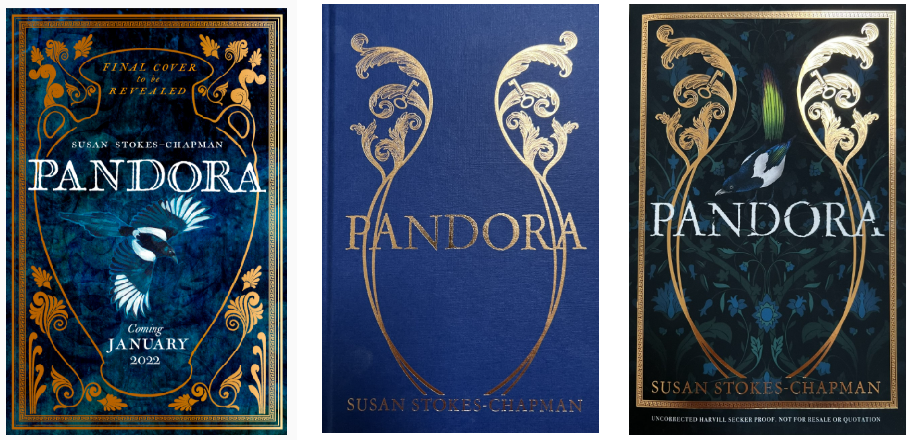
Left to Right: Placeholder Cover, Hardback Proof, Paperback Proof
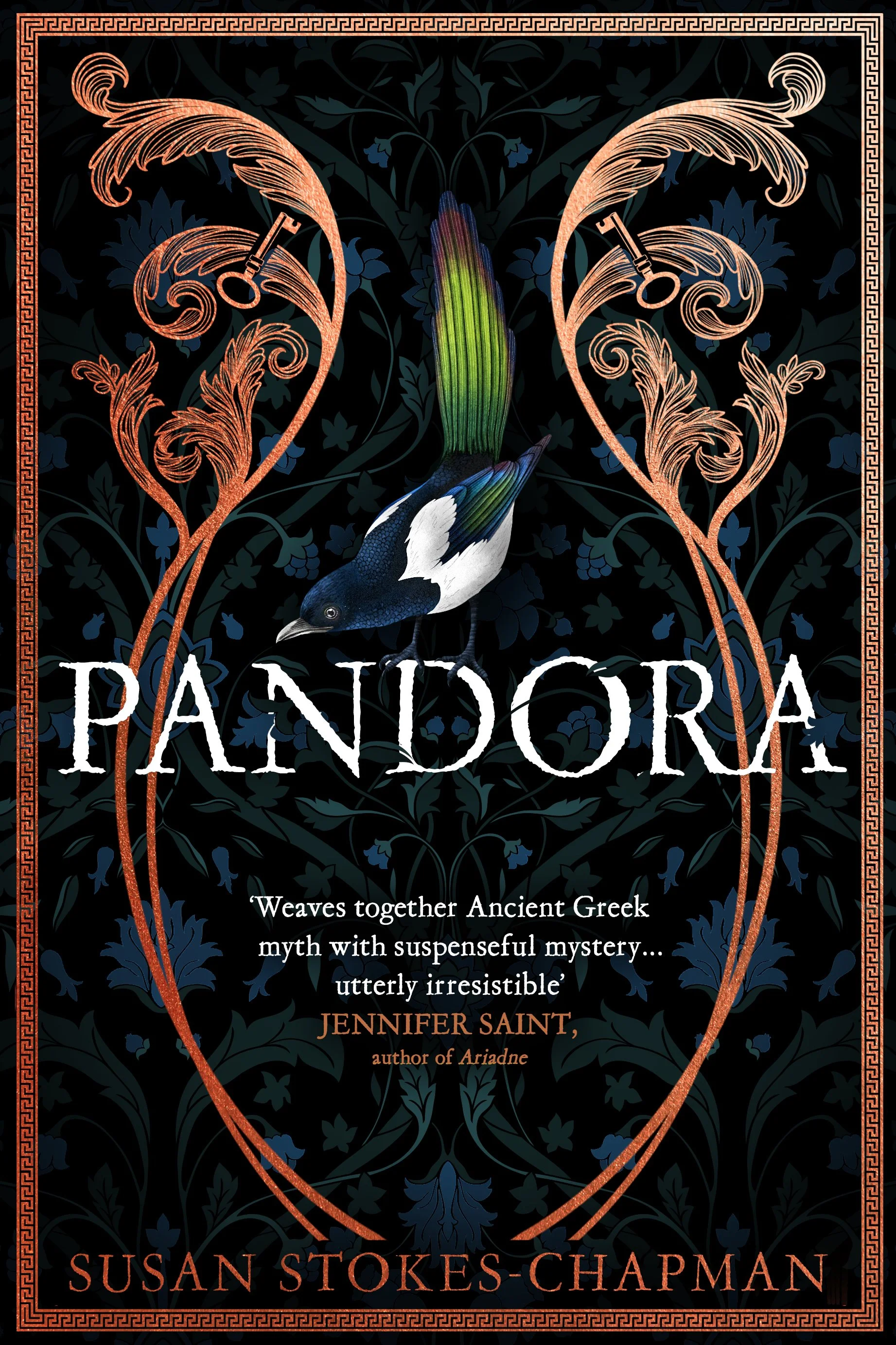
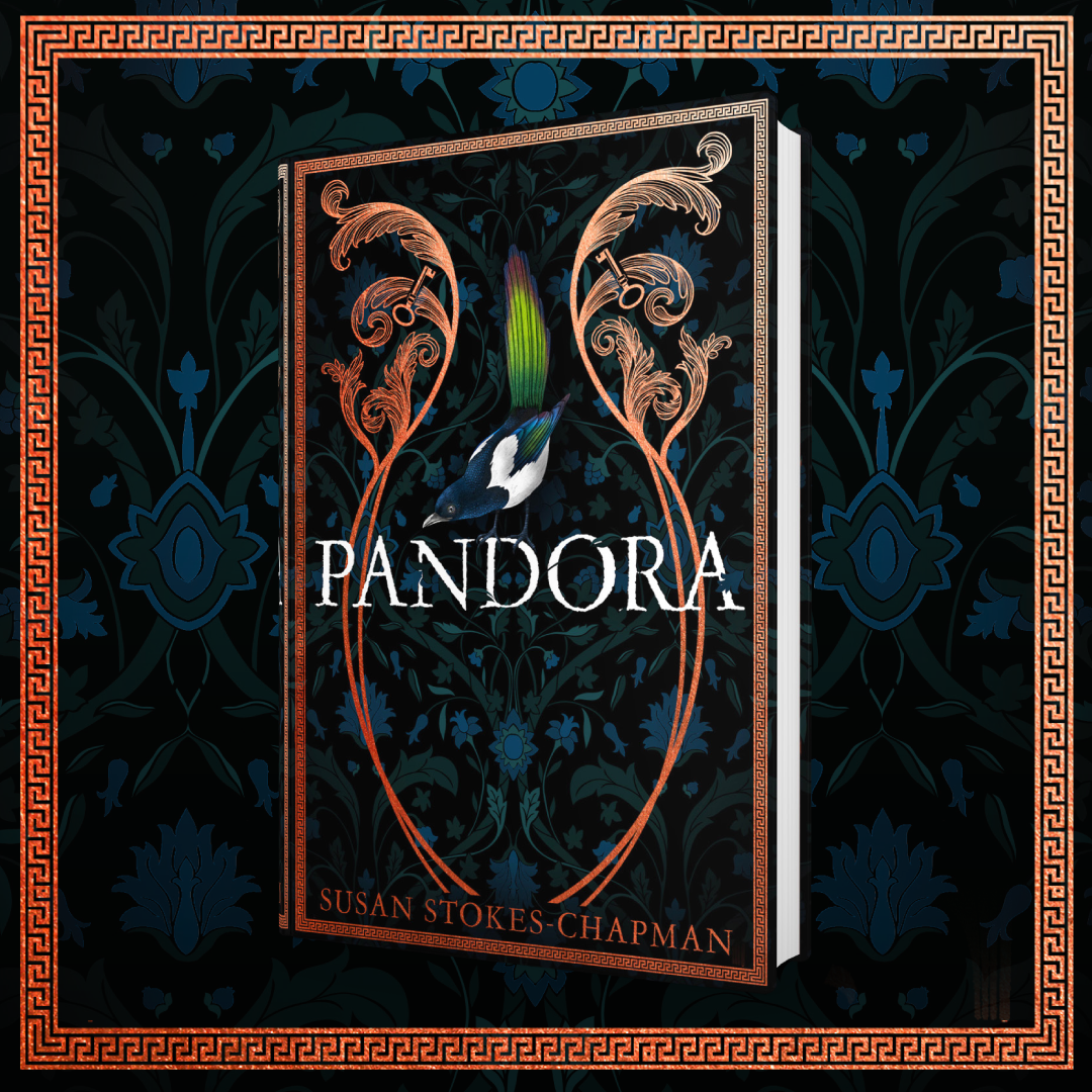
Final Hardback Cover
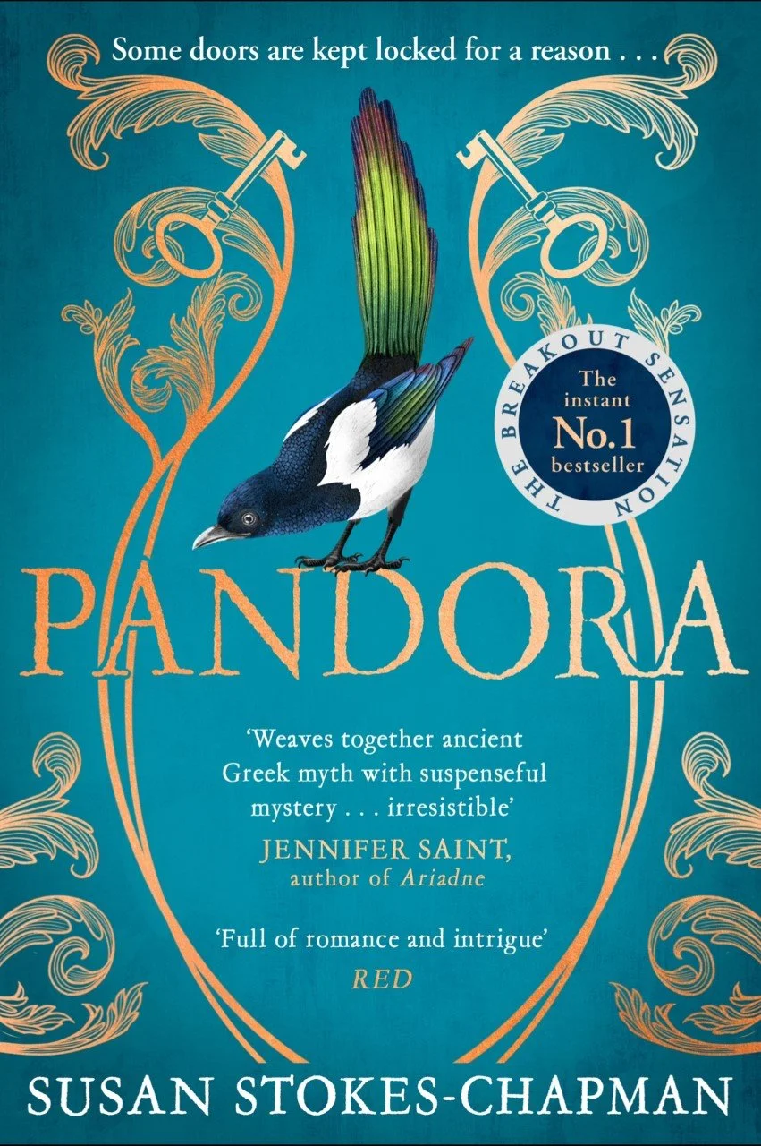
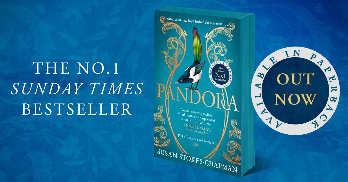
Final Paperback Cover
At each stage I was allowed a massive input for the design elements, for which I'm incredibly grateful as I know not all author's get to have a say, or at least not a big one. I was extremely lucky that Harvill were so willing to let me have a substantial contribution ... but I suspect they did get a little frustrated with me as I was very picky about the final cover!
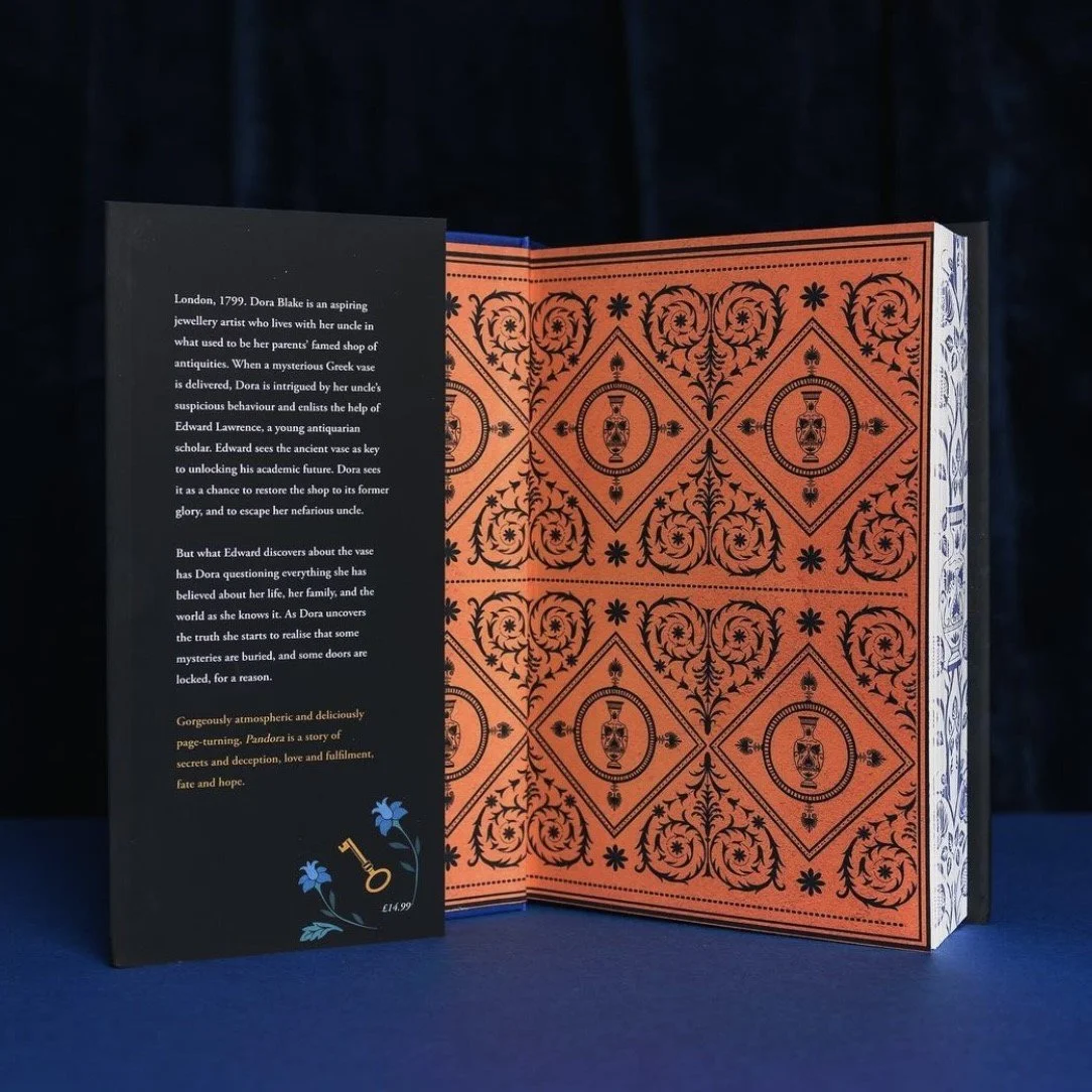
For the hardback publication there was a slight variation for the Waterstones Exclusive Edition - this featured sprayed edges and reversed endpapers:
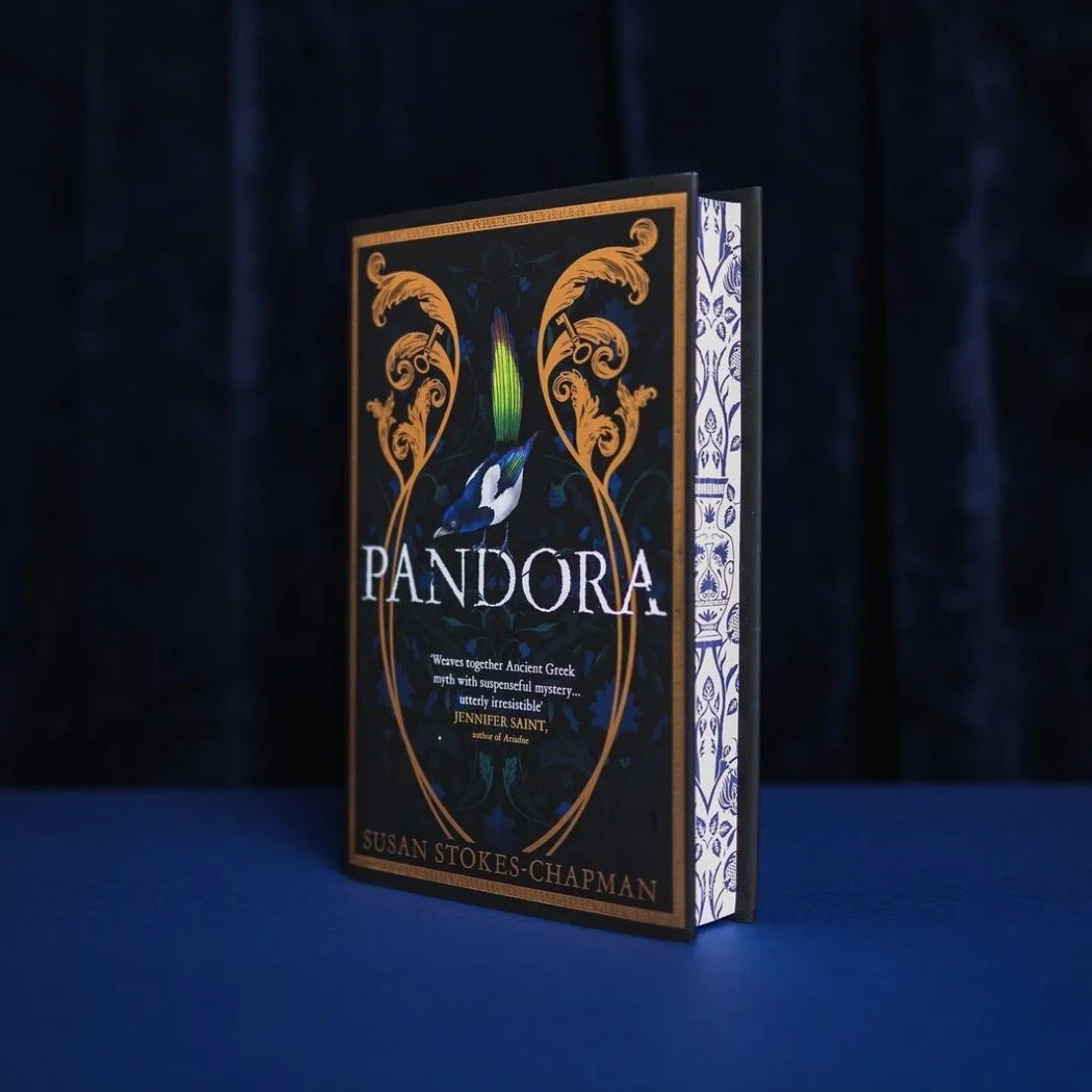
Whereas for the paperback publication, the Indie Bookshop Exclusive had blue sprayed edges -->
To encourage purchases for the paperback, Vintage Books also released an advert for radio, which you can listen to below:
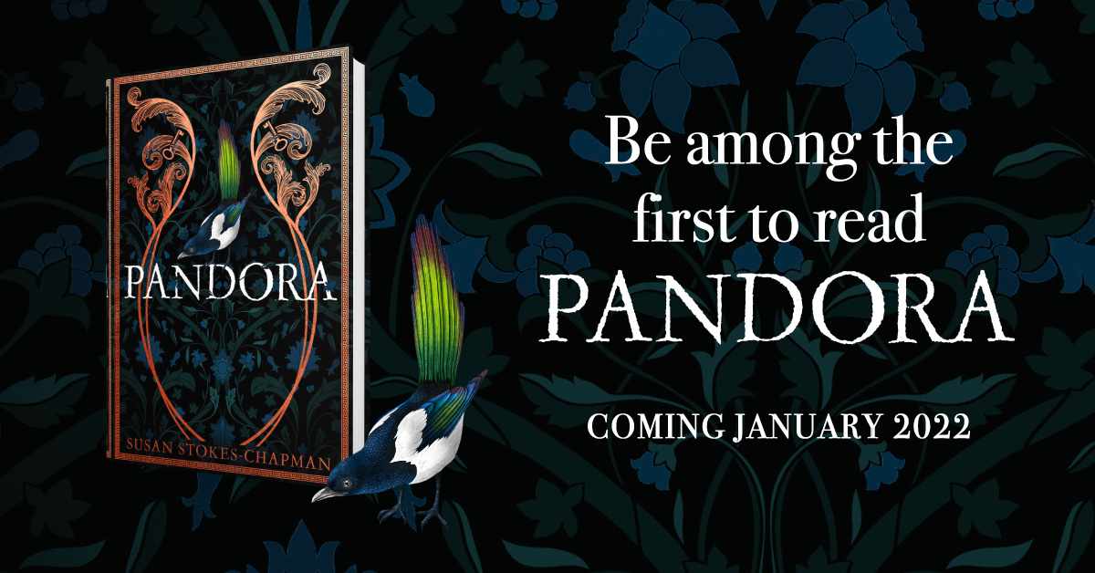
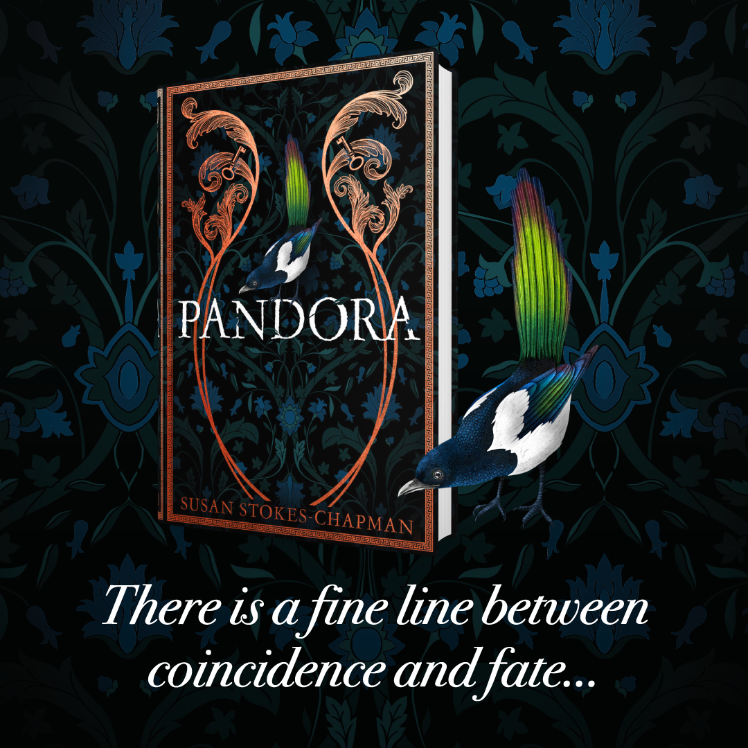
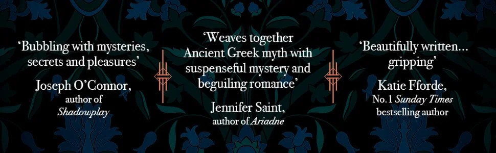
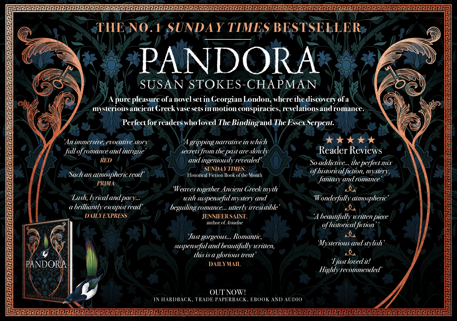
Marketing graphics
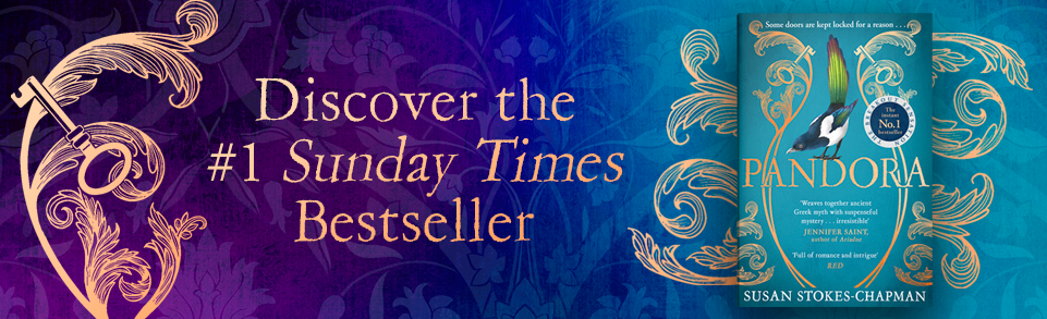
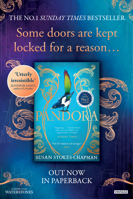
The design team at Harvill created lots of promotional graphics for me to use across the lead up to publication and beyond, as well as producing some rail/tube posters for the paperback (which was a dream come true). Here's just a selection!
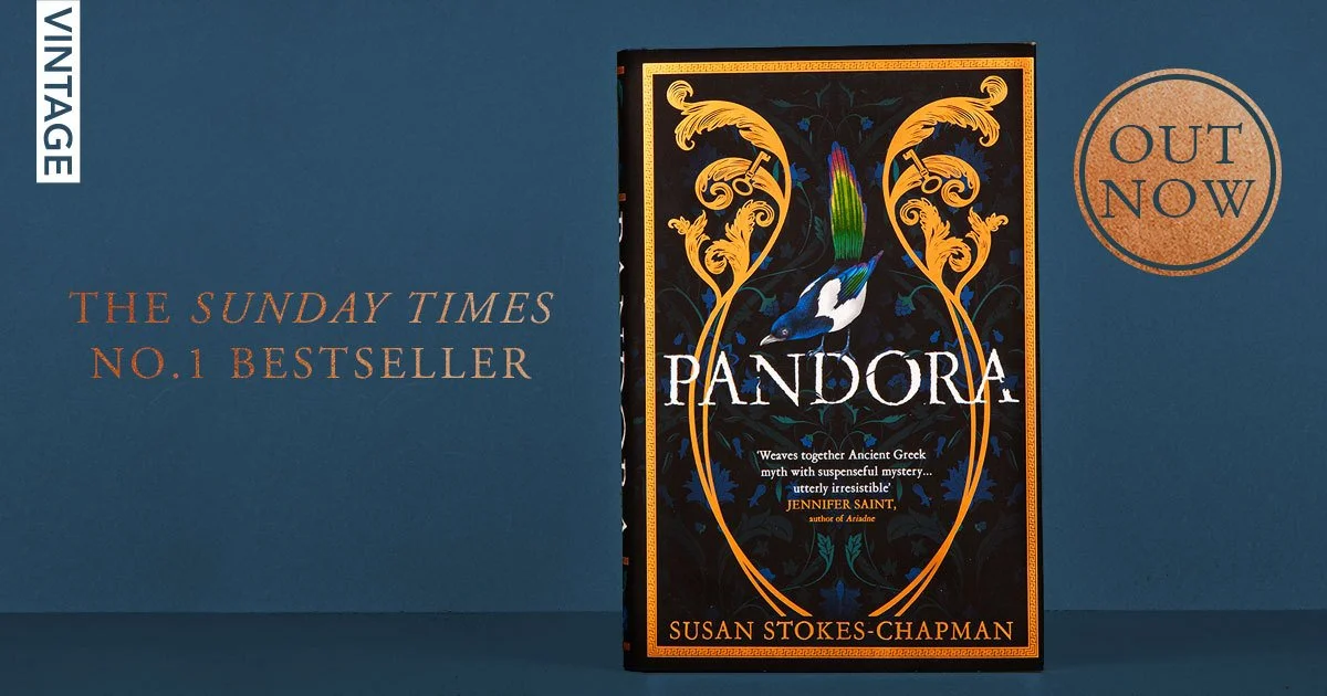
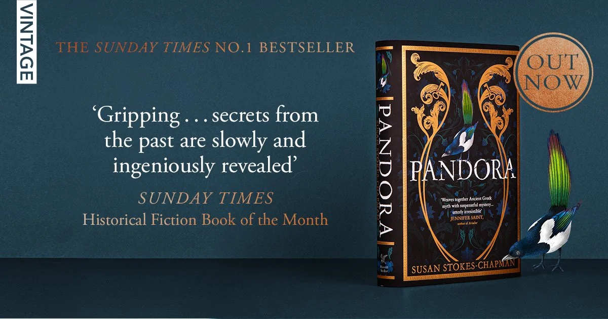
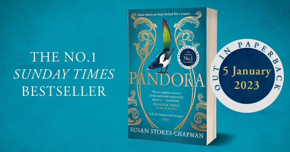


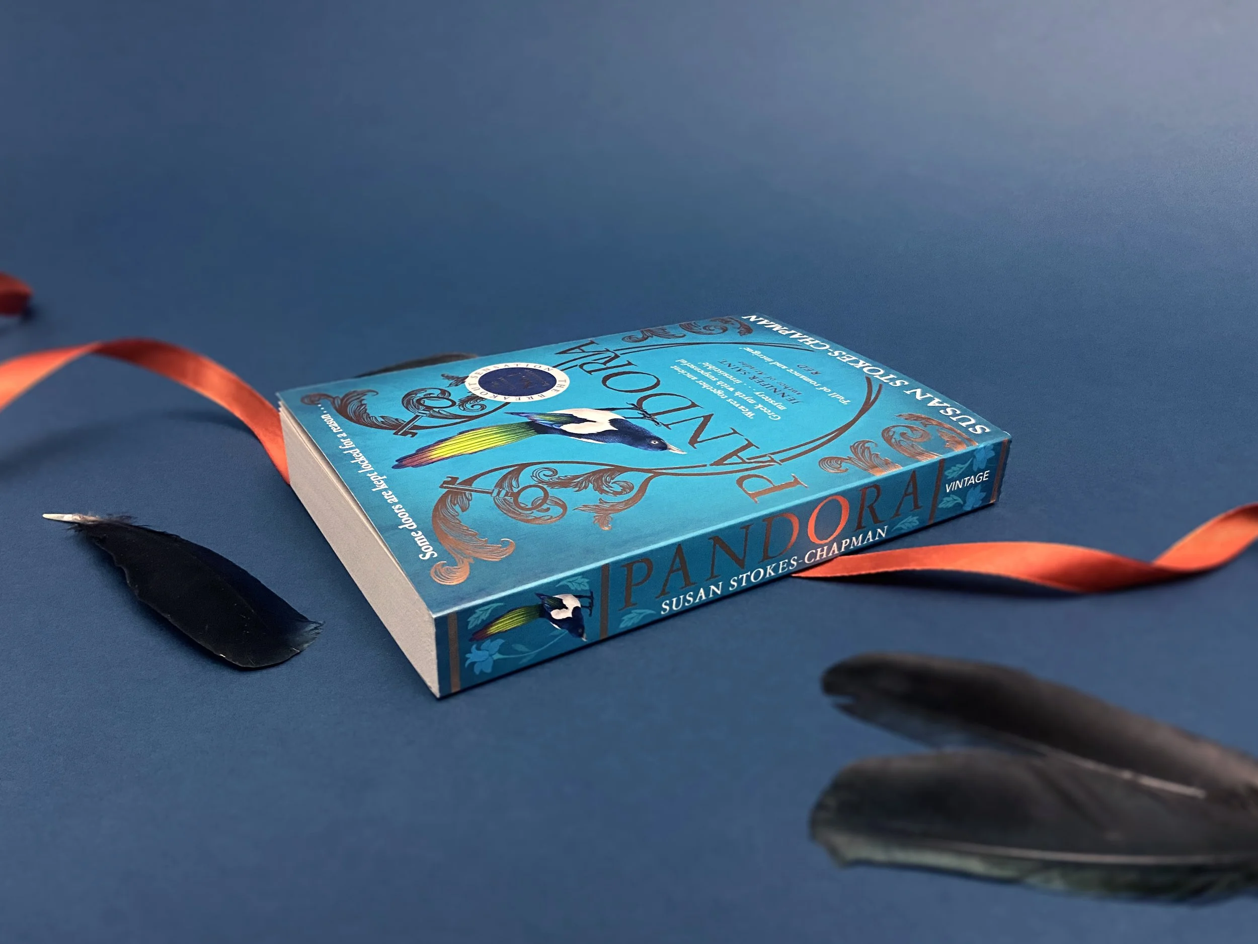
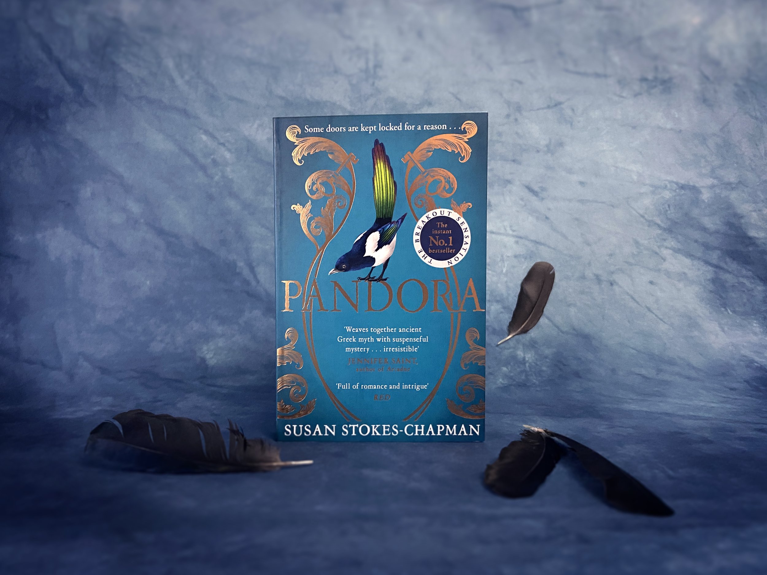
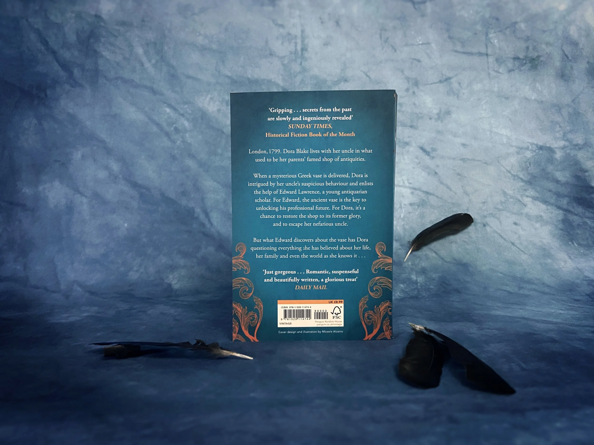
Looking pretty both inside and out
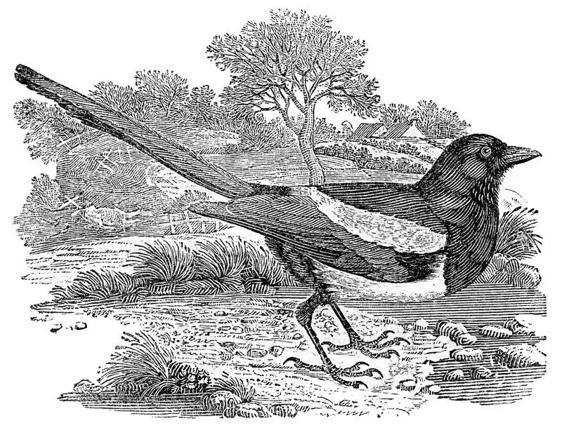
I made it clear from the start that I was keen to have an eighteenth-century feel throughout the novel, and I have been uncommonly lucky to have a publisher that was so accommodating! The typeface for the jacket cover is Garamold, the main text is Bodoni while the Part and Chapter headers are a variation of Caslon. These fonts were widely used in the Georgian period, and therefore made the novel feel and read more authentically. The artwork too is authentic; the magpie image used as the section dividers (known as a 'dinkus') was created by Thomas Bewick, an English wood-engraver and natural history author. What I especially adored about the finished copy of the novel were the two very obvious nods to the period in which it is set: the frontispiece and the trade card.
The Frontispiece
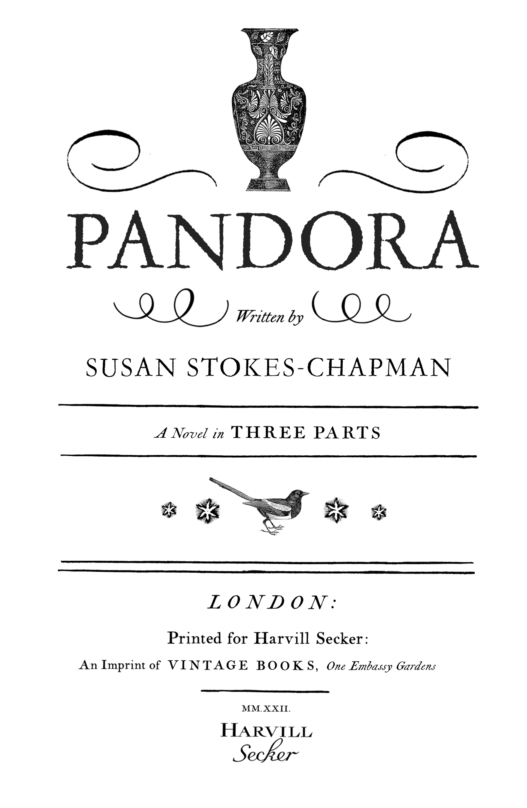
The styling is a slightly modern twist on a typical eighteenth-century frontispiece, found in many novels of the era, like the ones below. To personalise it towards Pandora, the magpie used here is the same Bewick engraving, and the vase was taken from the frontispiece of Teatro Universale, Raccolta enciclopedica e scenografica, published in the twilight years of the Georgian era (1836). And those little stars? These have been lifted from the trade card that acts as the epilogue of the novel ...
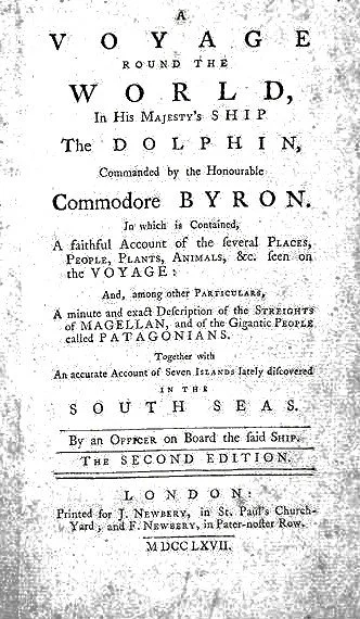
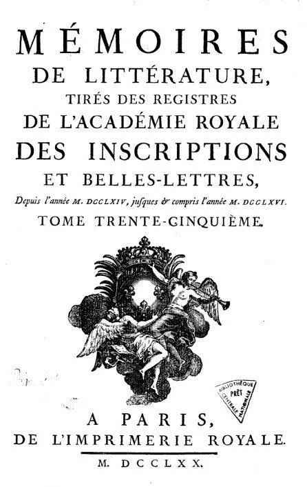
The Trade Card
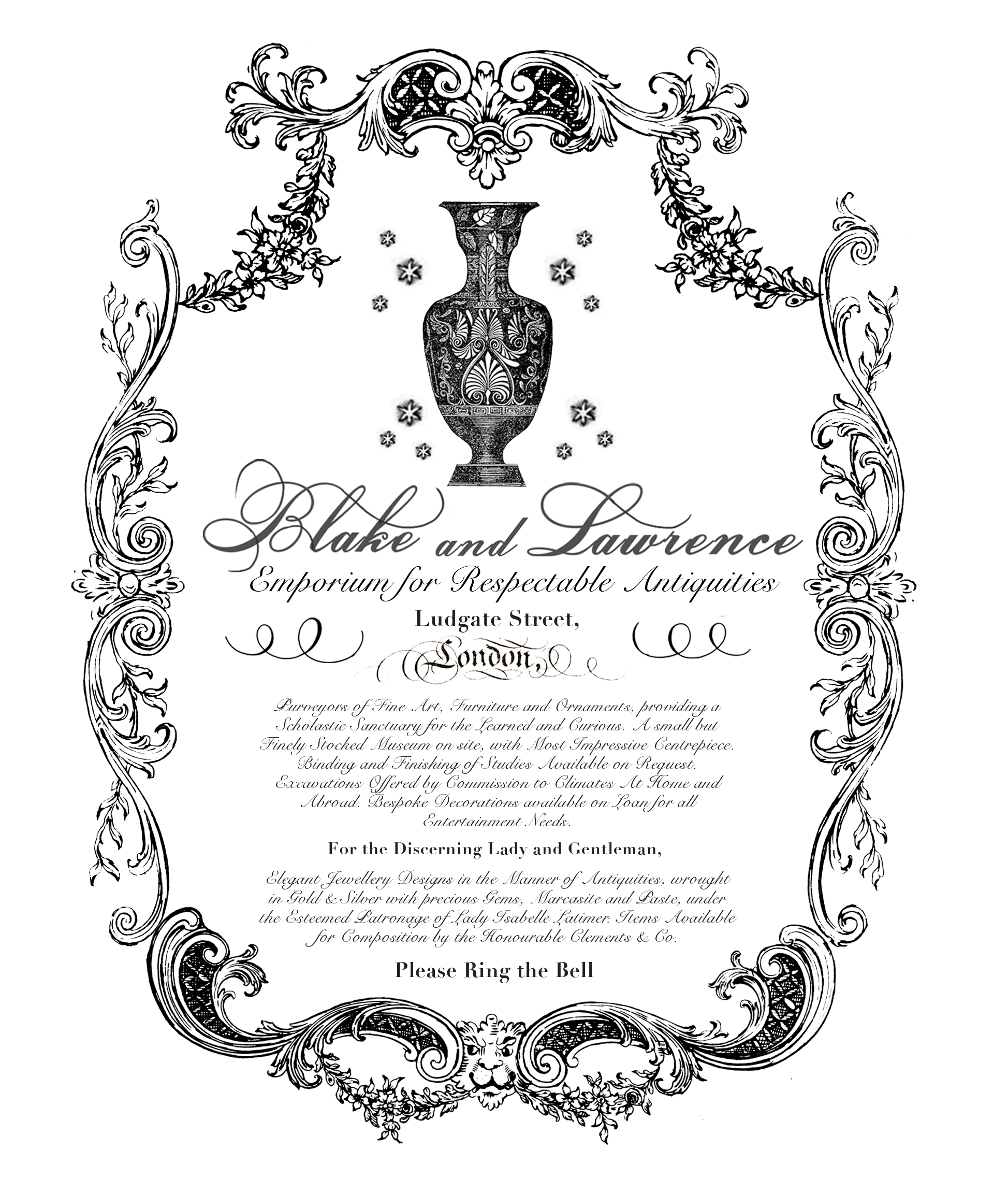
To ensure the same styling linked throughout, the same Teatro vase was used. The stars are actually an echo of another trade card which can be viewed here, and this ensured authenticity. However, the trade card for Pandora was given a bit of a modern lift too - there was a lot of text to fit on the page, and adding more graphics would have over-cluttered it and made the content difficult to read. Suzanne Dean did an absolutely phenomenal job of simplifying it yet keeping the authentic feel.
The endpapers
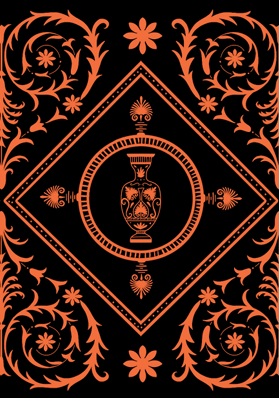
Micaela Alcaino also created my endpapers (with reversed colours for the Waterstones edition, pictured above), which used a simplified version of the Teatro vase in Micaela's own style, and added an architectural element that echoed one of the ceilings at Lansdowne House, a Georgian building in Berkeley Square, London, designed by the Robert Adam. To me, this linked in perfectly to the antiquity theme of the novel.
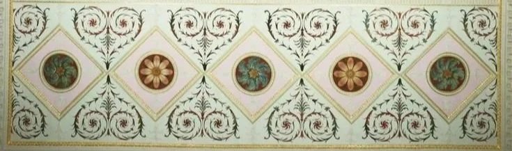
The freebies
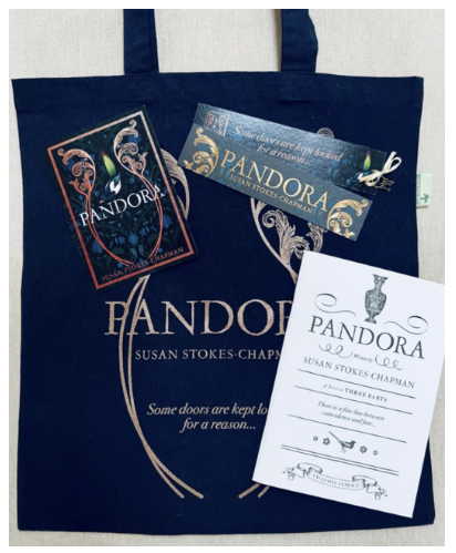
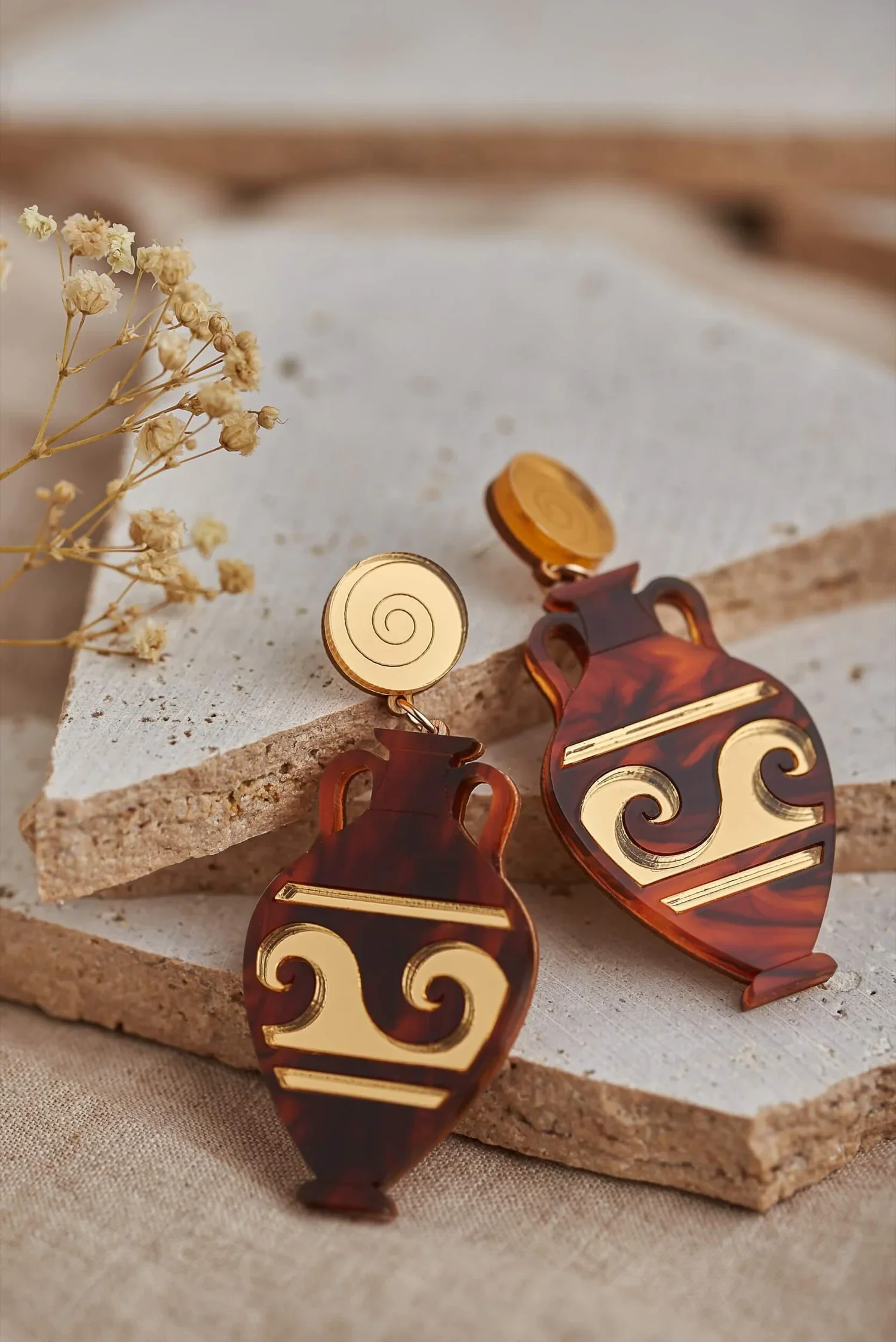
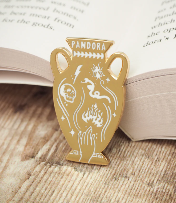
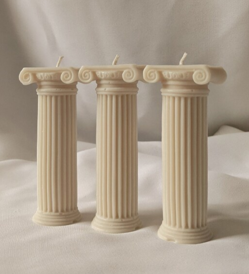
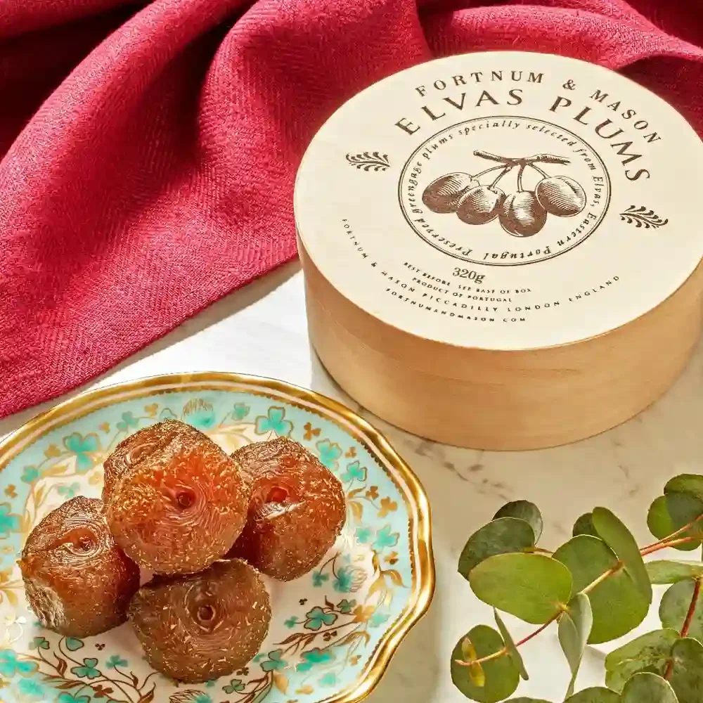
Postcards, samplers, bookmarks & tote bags galore! The marketing team did a sterling job with this and I was so pleased with them. We were also lucky to be allowed to use the Pandora Greek Myth pin created by Literary Emporium as part of the 'swag'. I added a few of my own things for personal giveaways which link to the novel as well - traditional sugar plums (see Chapter 3), a pair of vase earrings, necklace and hanging decoration by Plato's Fire, and a Greek antiquity themed candle created by the very talented Heritage Candles Co.
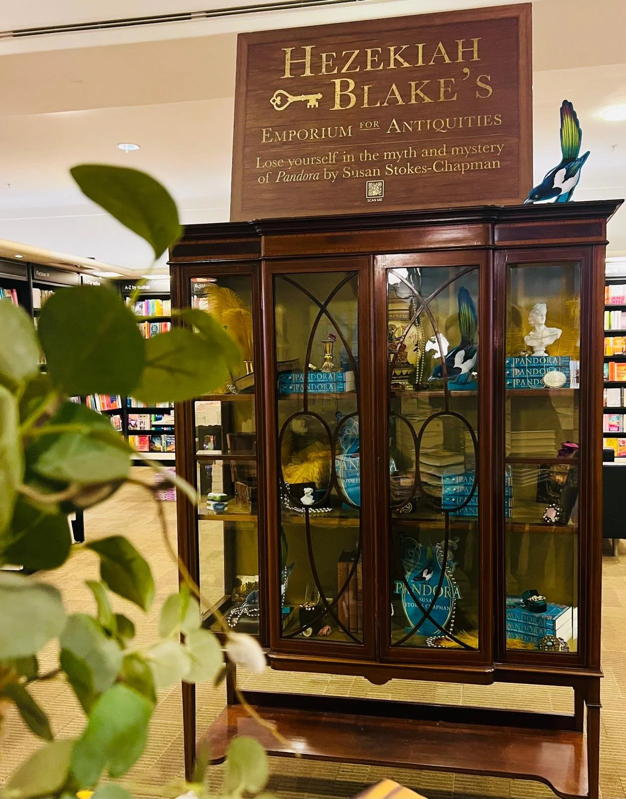
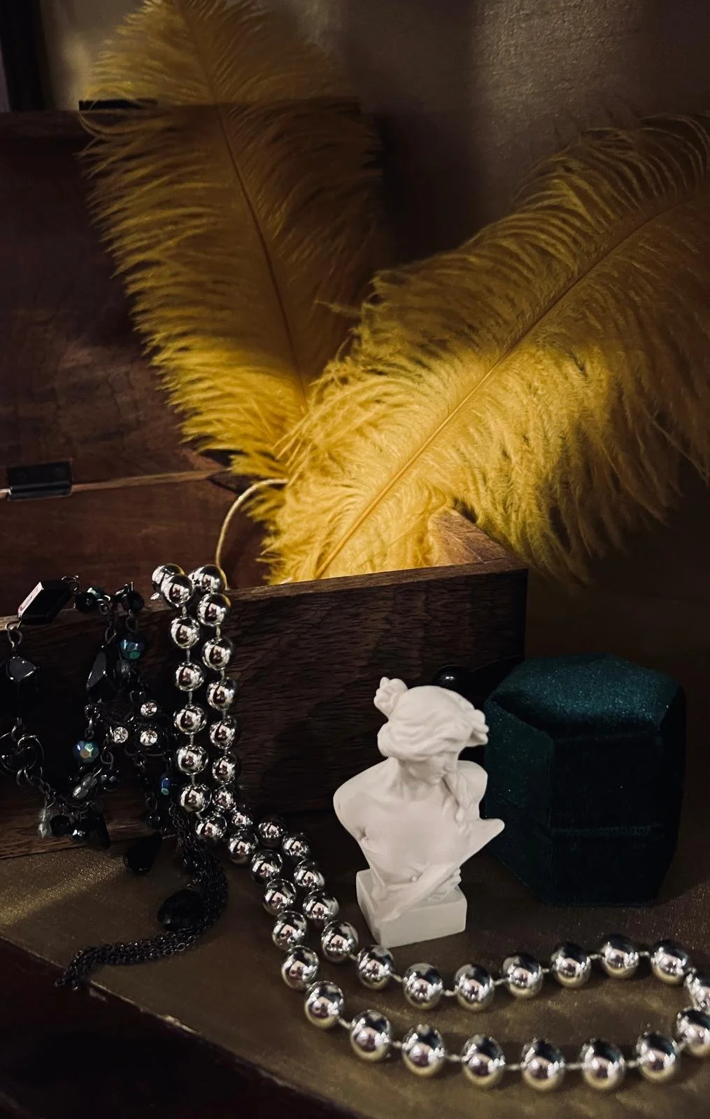
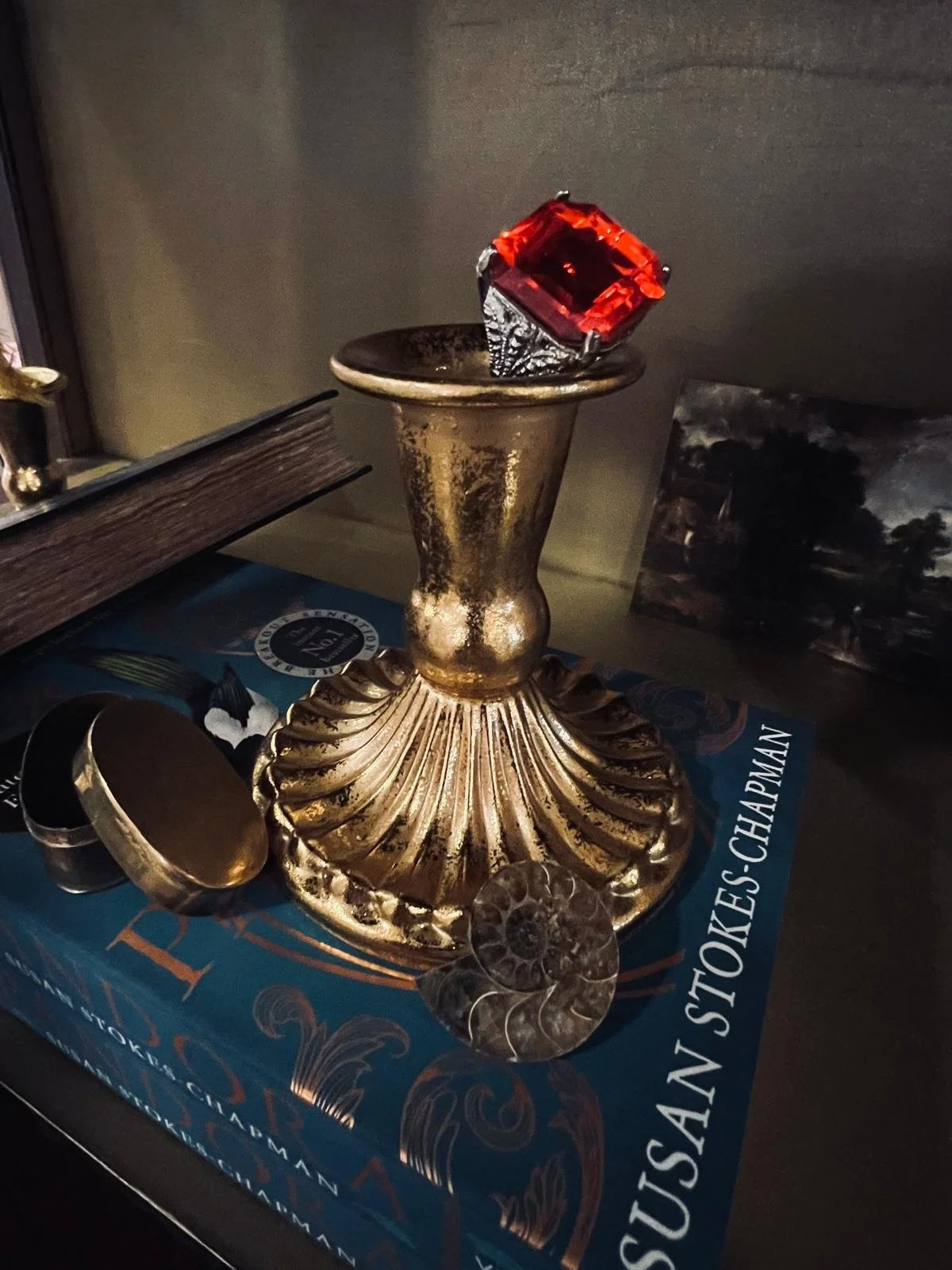
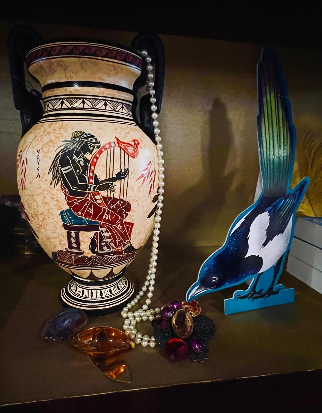
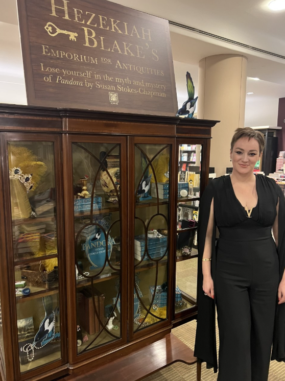
Hezekiah Blake's Emporium for Exotic Antiquities
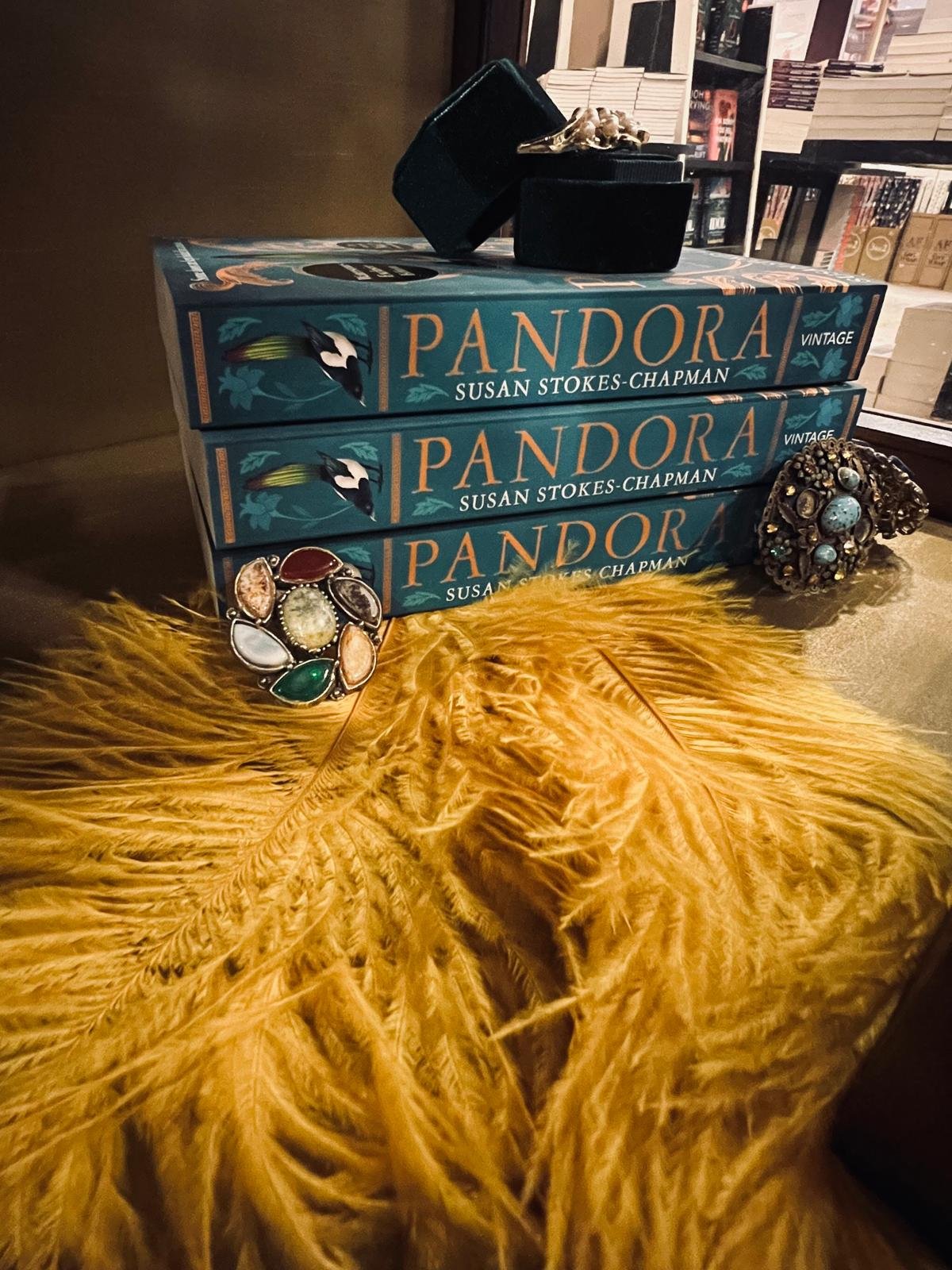
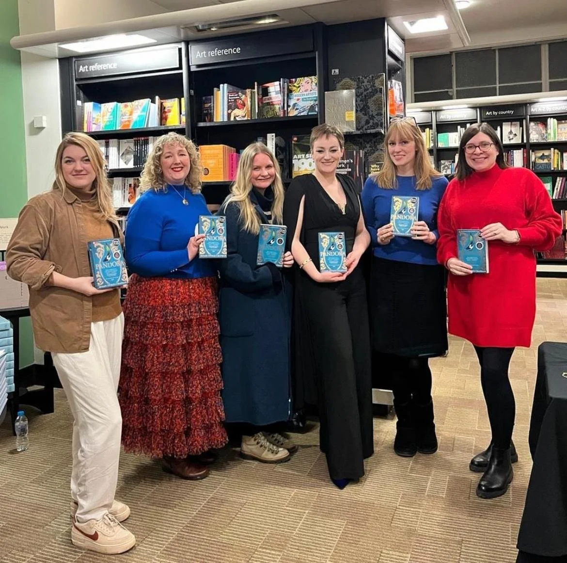
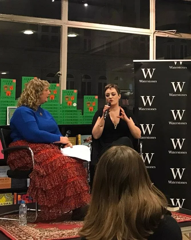
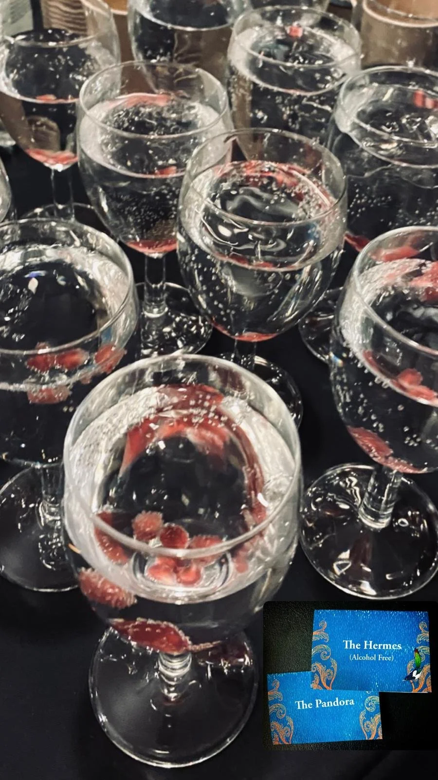
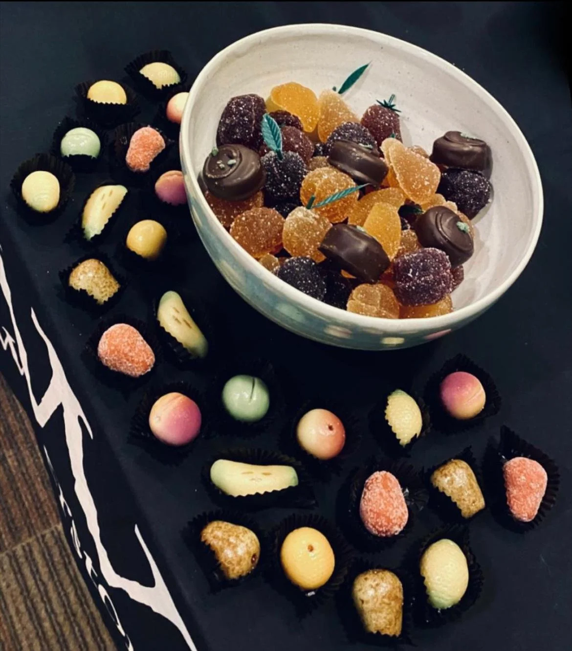
I've saved the very best until last. Covid prevented us setting up an installation for the hardback, but for the paperback release we were able to bring Blake's Emporium to life. The level of detail included here was eye-wateringly beautiful, and words just don't do it justice. The cabinet was set up in Waterstones Liverpool, then moved on to Waterstones Piccadilly where I had my paperback launch. Due to Covid (again), this was in lieu of a hardback launch but the wait was worth it - I had a lovely crowd who asked insightful questions, an excellent chair in the form of Jennifer Saint, a supportive turnout of fellow authors, and we were all treated to themed drinks (a 'Hermes' of Gin, Lemon and Elderflower cordial fizz, and a non-alcoholic 'Pandora', minus the gin) & nibbles (marzipan fruits and jellies, which were all the rage in the Georgian period). The paperback launch for Pandora was the icing on the cake, rounding off a fabulous debut year. Thank you to everyone at Harvill Secker and Vintage Books for championing my novel so enthusiastically, and really giving Dora's story the best start in life it could possibly get. Truly, it has all been a debut author's dream!